Overview
Fonazzo is a luxury brand built around the principles of refinement, exclusivity, and timeless elegance. The brief called for a visual identity capable of commanding instant recognition in premium markets. An identity that communicates sophistication without over-statement, and speaks to a discerning audience who values heritage, craftsmanship, and quiet prestige. The challenge was designing a mark that felt genuinely elevated rather than merely expensive-looking, avoiding the clichés of luxury branding while still operating fluently within its conventions. The result is a logo that earns its place in the upper tier not through decoration, but through the quality of its decisions.
Creative Process
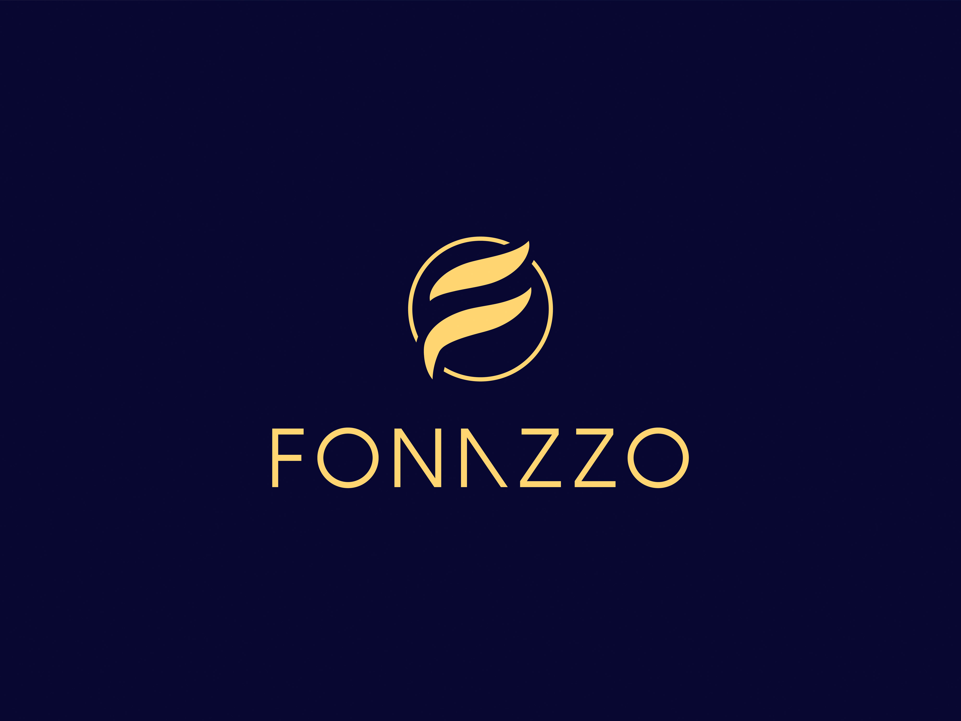
The process began with the name itself. Fonazzo carries an Italian cadence; warm, confident, and culturally loaded with associations of artisanal excellence and old-world craft. Our mind map led to words like fluid, precious, crest, motion, and enclosure. The letter 'F' became the natural starting point, but a static or geometric interpretation was immediately dismissed. Luxury marks live and die by their sense of craft, and dozens of explorations were made before this mark emerged. Two sweeping, asymmetric strokes that read clearly as the letterform while simultaneously evoking the movement of cloth, the curl of a brushstroke, or the flow of precious metal being worked by hand. The circle was introduced as a frame with weight to anchor the mark without caging it. The break in the circle reflects this guided freedom. It depicts a brand still in motion, still being written. Below the symbol, the wordmark FONAZZO is set in wide-tracked geometric capitals, the letterforms refined at the glyph level with sharpened diagonal cuts; a custom detail that rewards close inspection and makes the name visually proprietary without altering its legibility.
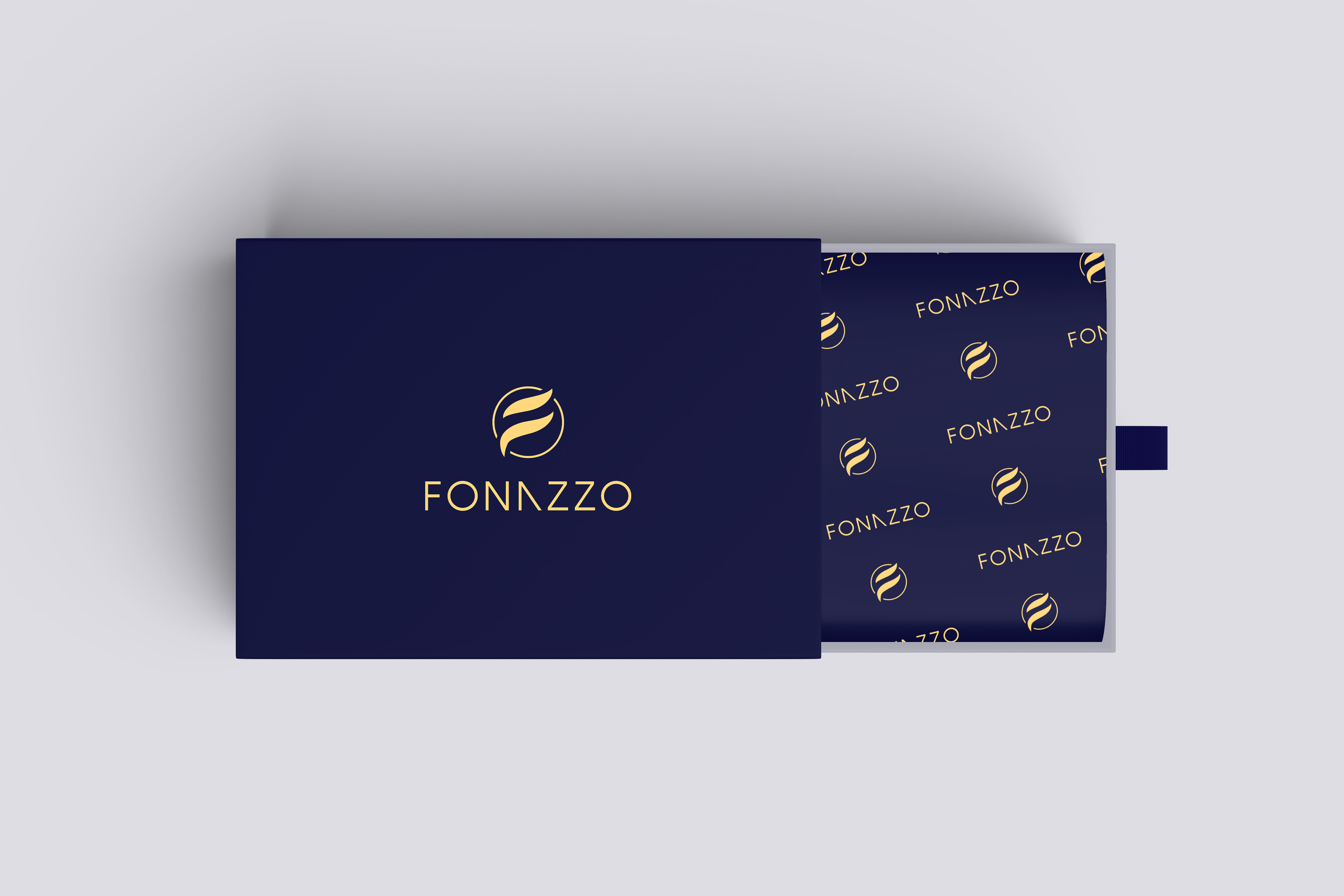
Colour System
The colour system is built on two primary tones in deliberate opposition. Deep Navy is the dominant ground; a dark, almost ink-like blue that carries authority, depth, and the quiet confidence of established institutions. It creates the conditions for gold to perform at its most luminous. Warm Gold is the brand's expressive register: precious, warm, and universally understood as a signifier of quality and rarity. The gold is rendered to give the symbol the appearance of catching light, as engraved or cast metal does. The palette asks for nothing else.
Design System
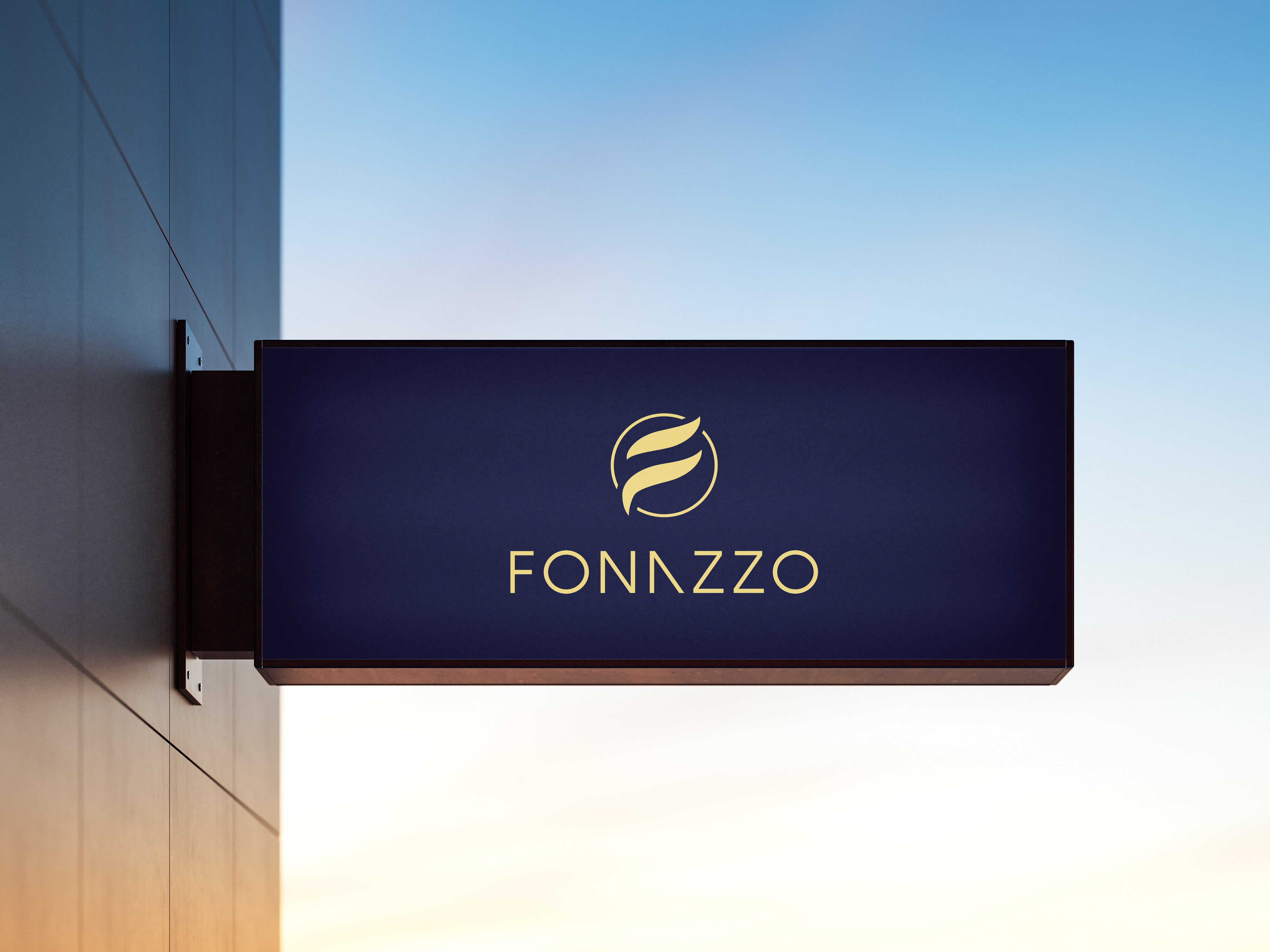
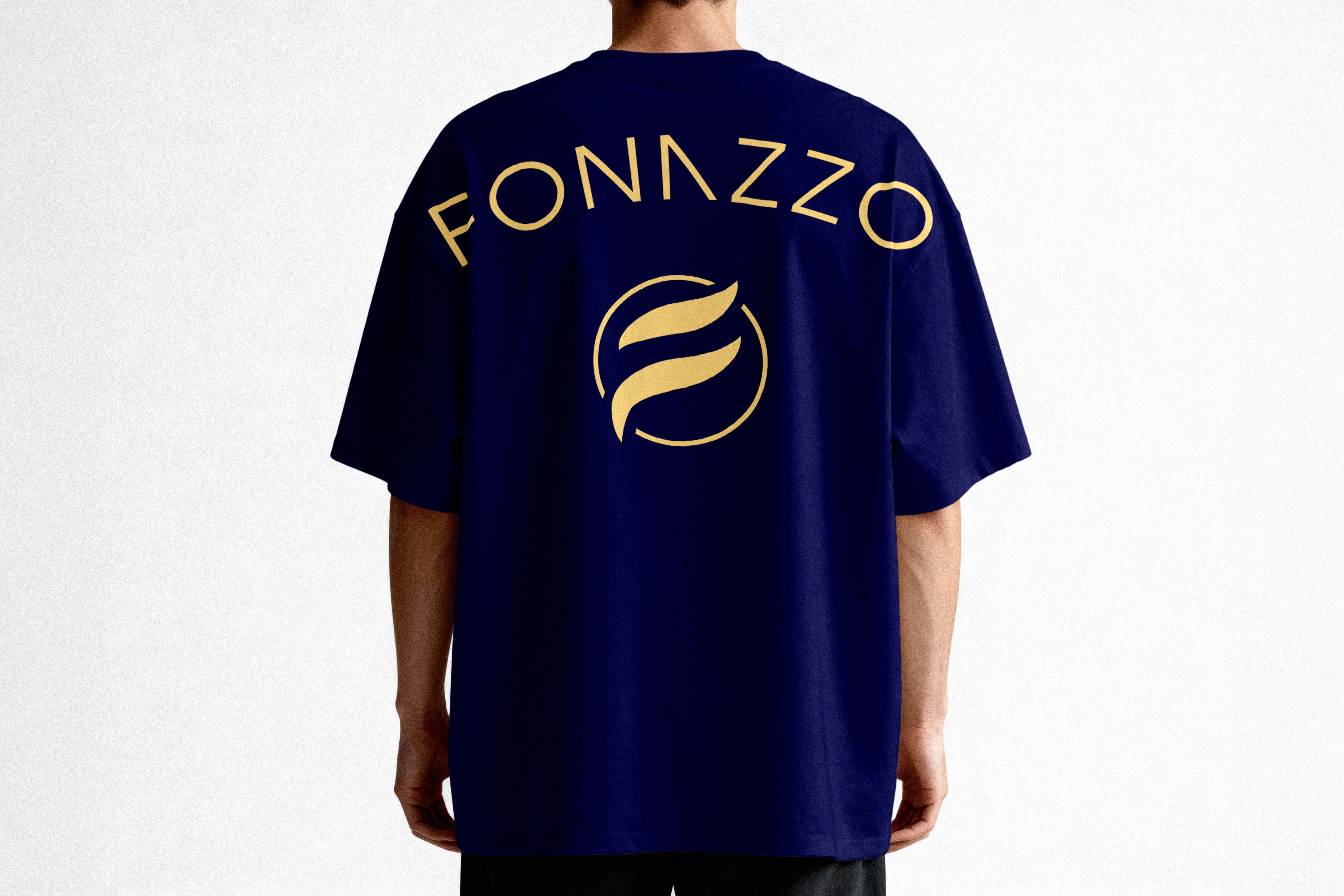
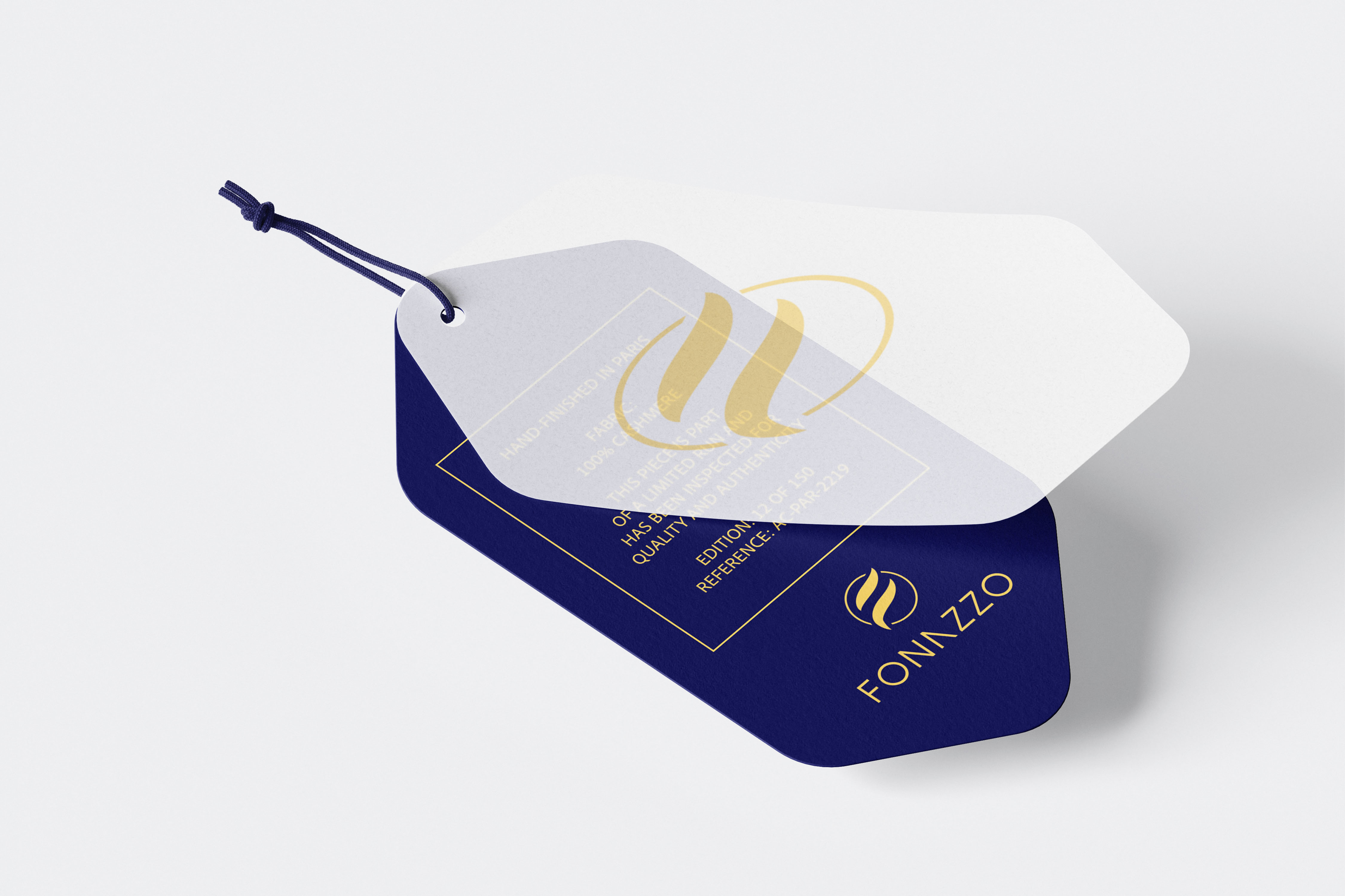
The identity is structured as a two-tier system. The primary lockup pairs the encircled monogram above the wordmark in a stacked configuration, with considered negative space between the two elements ensuring the mark breathes and hierarchy is clear. For contexts demanding a more compact or graphic mark such as wax seals, embossed hardware, app icons, social avatars etc, the monogram isolates cleanly as a standalone symbol with no loss of authority. At every size from a 16-pixel favicon to a billboard, the icon strokes remain legible and the circle holds. A strict exclusion zone, equal to the height of the circular frame, is maintained on all sides. The wordmark is never stretched, rotated, or separated from its prescribed weight. It is the signature of the brand, not a flexible asset.
Outcome
The Fonazzo identity achieves what the finest luxury marks always do: it makes desire legible before a word is read. The monogram alone communicates craft, movement, and precious material. The wordmark extends that feeling into language, its custom letterforms confirming that nothing about this brand is off-the-shelf. Together, the full lockup positions Fonazzo in the space where the best luxury brands live. Not explaining their value, but simply embodying it, and trusting that the right audience will recognise the difference.