Overview
Exctly is a digital strategy and lead generation service built to help small and medium-sized enterprises reach, attract, and convert ready-to-buy customers. Operating under the tagline Build · Engage · Grow, the company needed a visual identity anchored in one idea above everything else: precision. The challenge was designing a brand mark that felt approachable and modern for SME owners managing tight marketing budgets, while simultaneously projecting the authority and effectiveness of a team with over 15 years of industry experience — a balance that is harder to strike than it sounds.
Creative Process
The design process began not with tools, but with language. The name "Exctly" is itself a statement of intent — a deliberate shorthand of the word "exactly," implying that nothing is left to chance. Words like target, slice, segment, direction, and momentum became the design vocabulary. From there, the natural starting point was the letter "E," and dozens of iterations explored how that character could carry both a directional quality and a sense of segmentation, echoing the ARCC framework at the heart of Exctly's methodology: Attract, Reward, Capture, Convert. The breakthrough came when the circle was recognised as the perfect container. A pie chart divided into tonal segments communicates market analysis, data literacy, and precision targeting simultaneously — all core to what Exctly sells. The negative space within the circle creates an implied "E" or forward-pointing arrow, layering in a subtle but energetic sense of direction.
Shape & Form
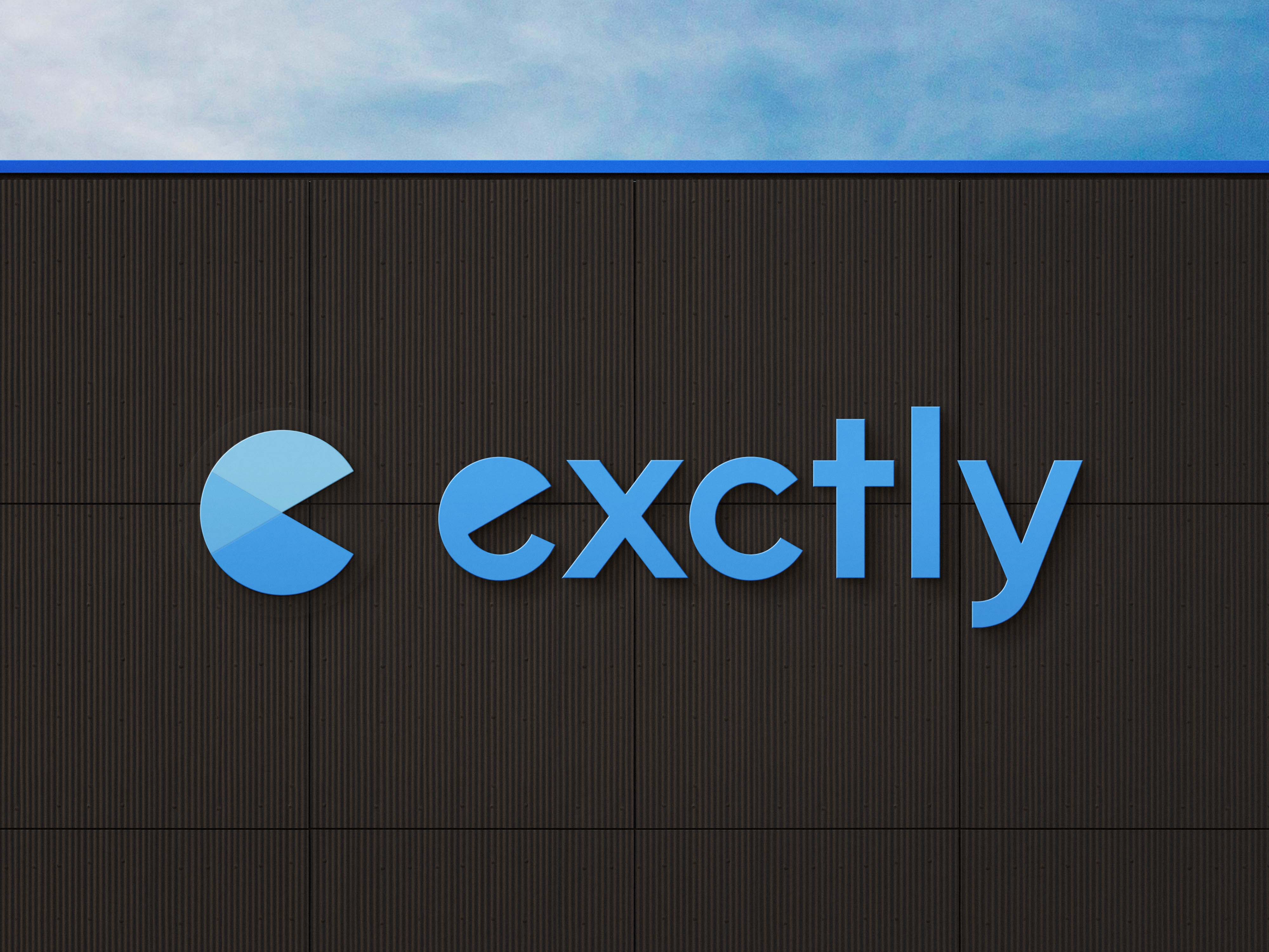
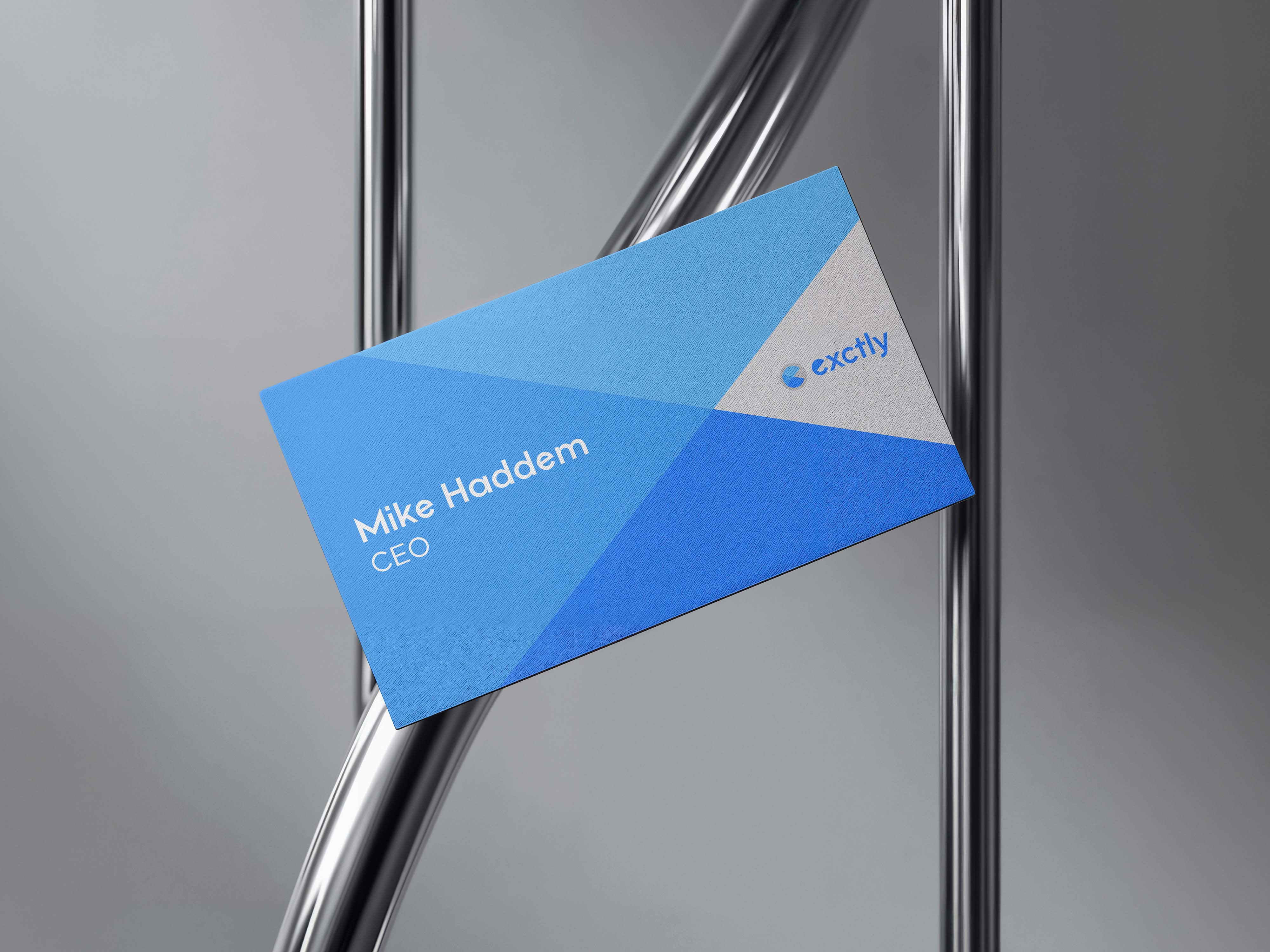
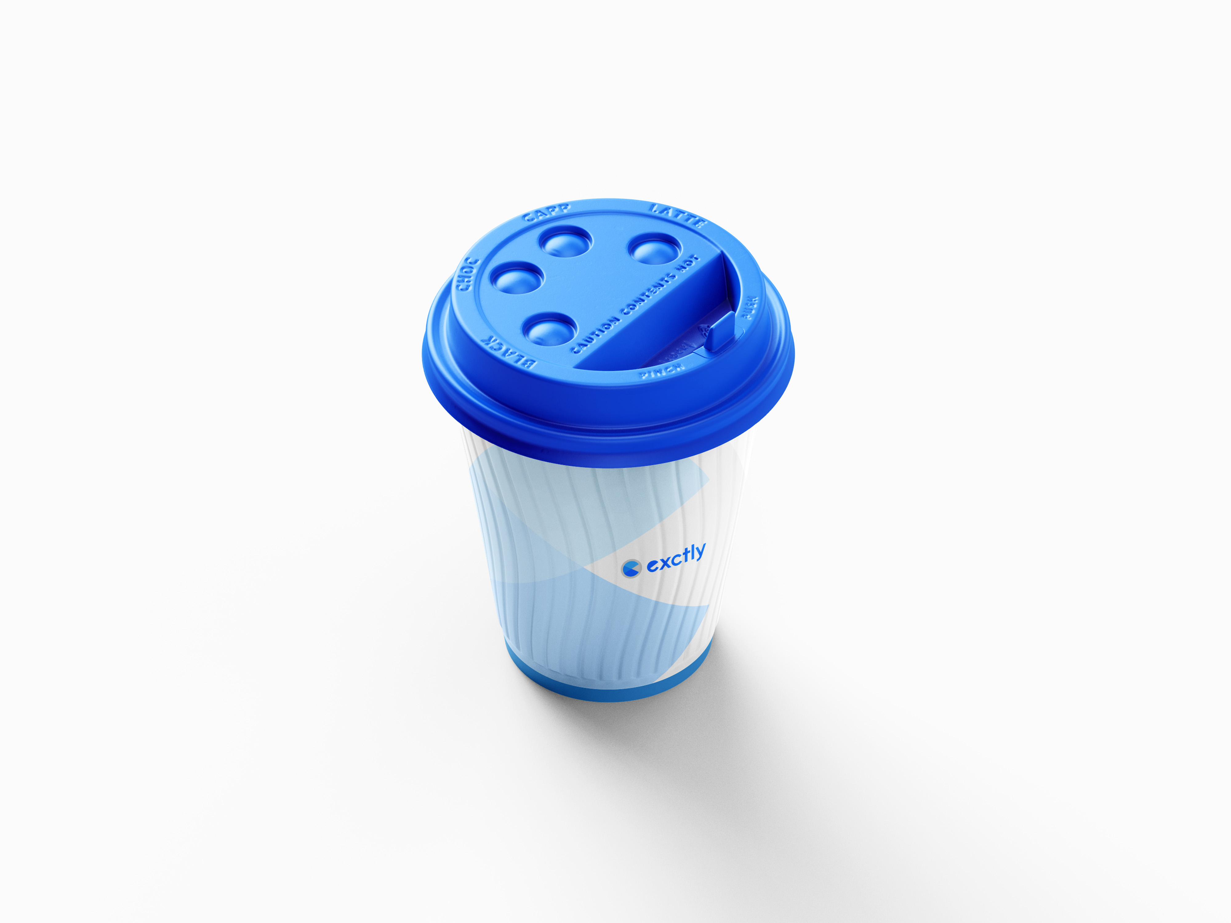
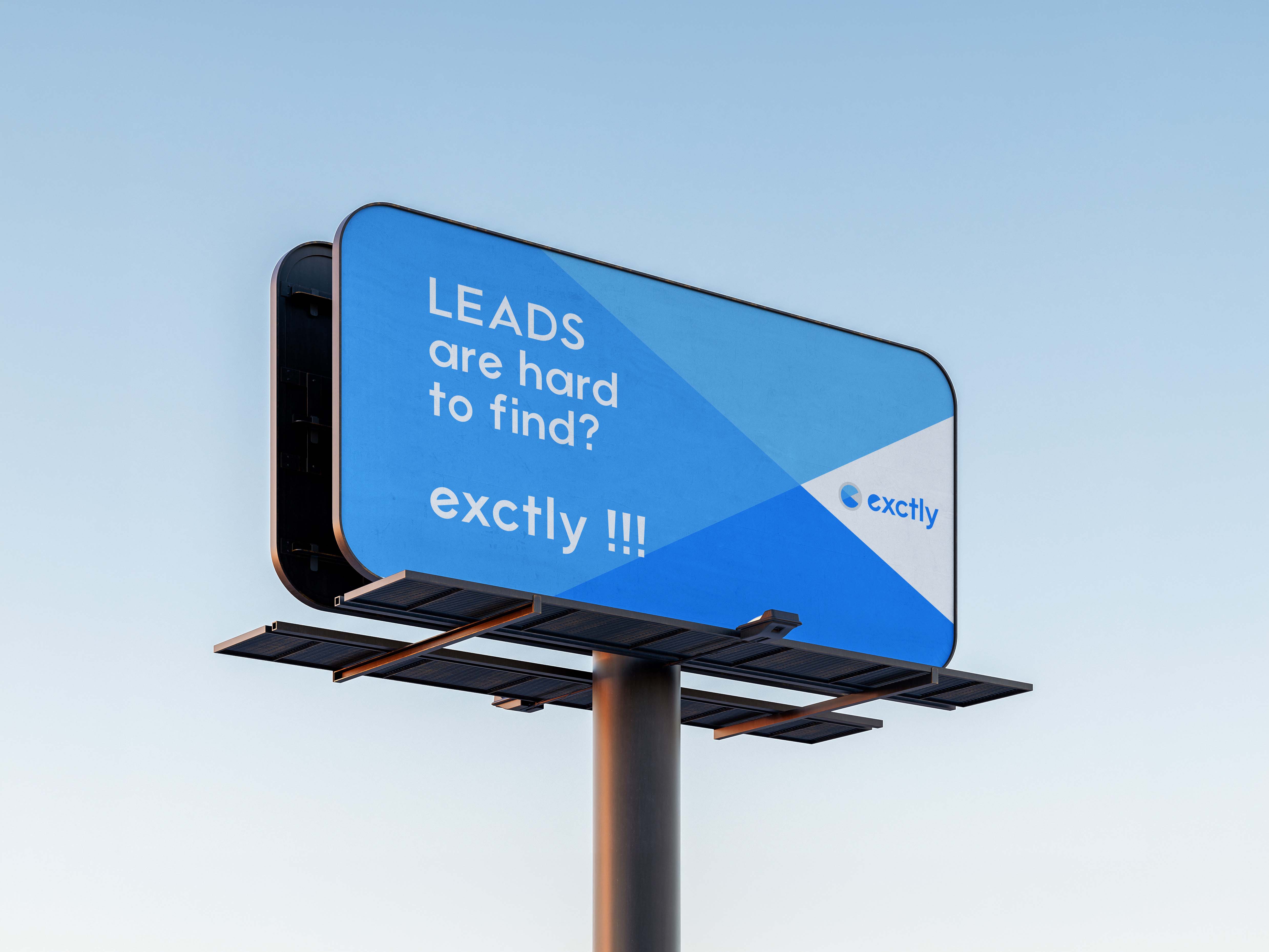
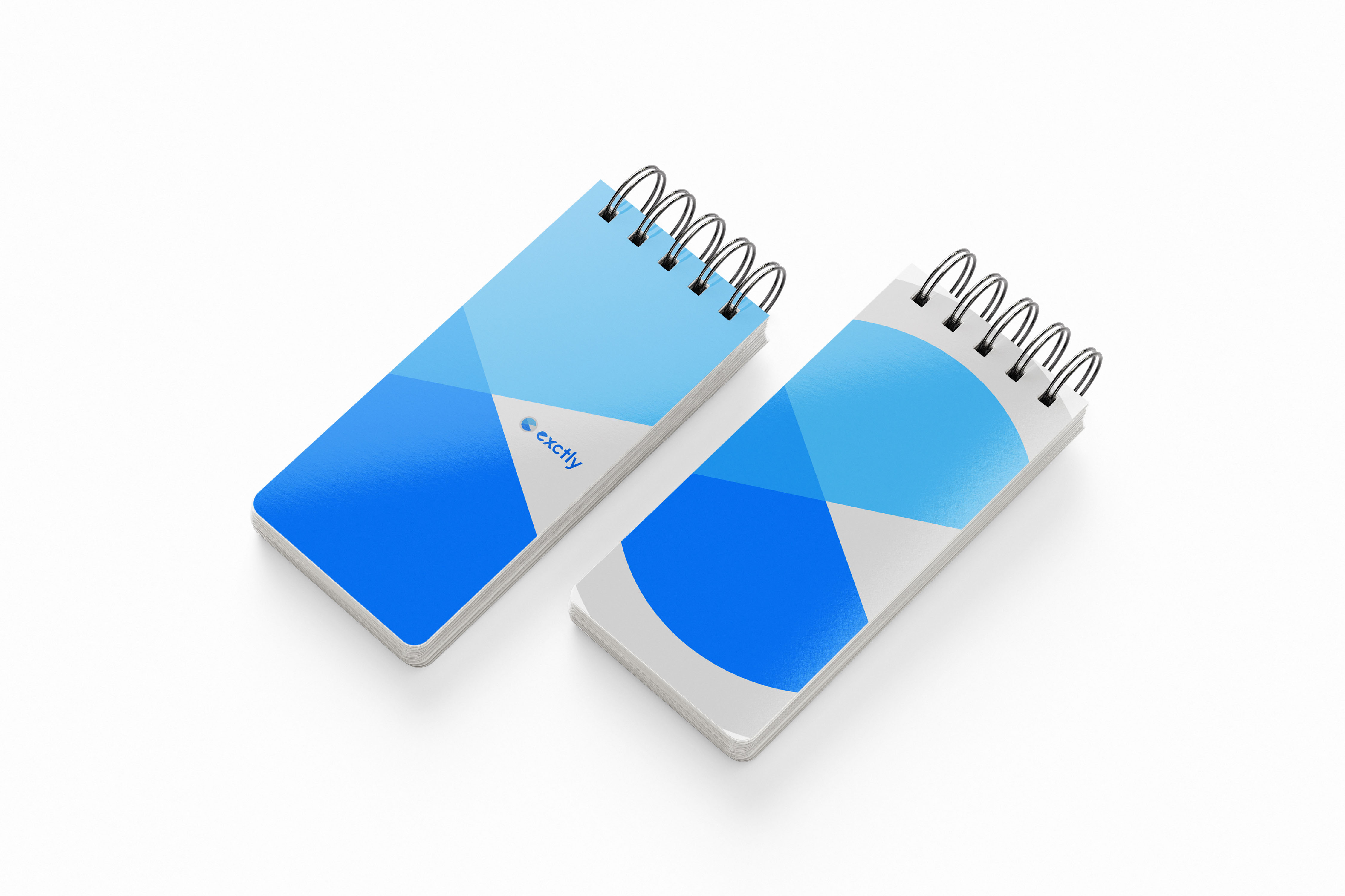
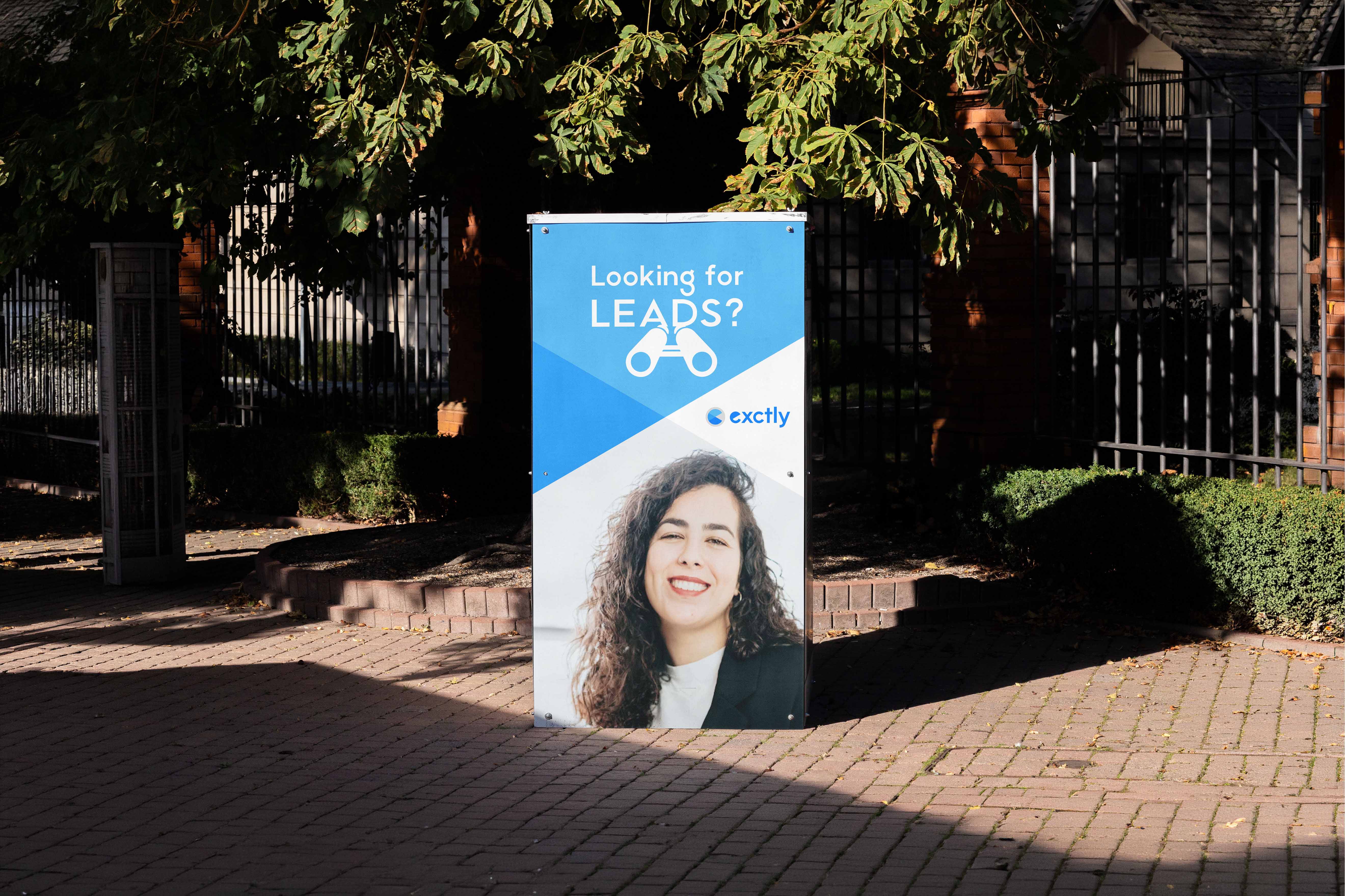
The final mark is composed of three distinct visual layers. The outermost element is a soft grey ring — not a hard outline, but a halo that encircles the icon and signals completeness without aggression. It represents the full market landscape, quietly containing the more assertive forms inside it. Within that ring, the circle is divided into two blue tones: a light sky blue forming the base field, and a deeper electric blue cutting through it as a pie segment, directly visualising the act of identifying and isolating the right audience from the noise of everyone else. A third segment, rendered at reduced opacity, anchors the lower-right quadrant and adds visual depth — a quiet suggestion that there is always more strategic work happening beneath the surface than what is immediately visible. Paired with a rounded, lowercase geometric sans-serif wordmark, the full lockup holds a productive tension: informal in tone, precise in effect.
Colour System
The colour system is built on a single-hue blue expanded across three tonal expressions. Electric Blue (#1B73E8) is the primary brand colour — assertive, trustworthy, and deeply associated with intelligence and technology. In the icon, it represents the targeted segment, the exact audience Exctly helps its clients reach. Sky Blue (#63A8F5) provides hierarchy within the icon itself, representing opportunity and the broader landscape before strategy is applied. Stone Grey grounds the palette, preventing the blue-dominant identity from reading as cold or clinical, and adding warmth through contrast. Together, these three values form a system that is immediately coherent, remarkably flexible, and free of the visual noise that plagues most marketing brands.
Design System
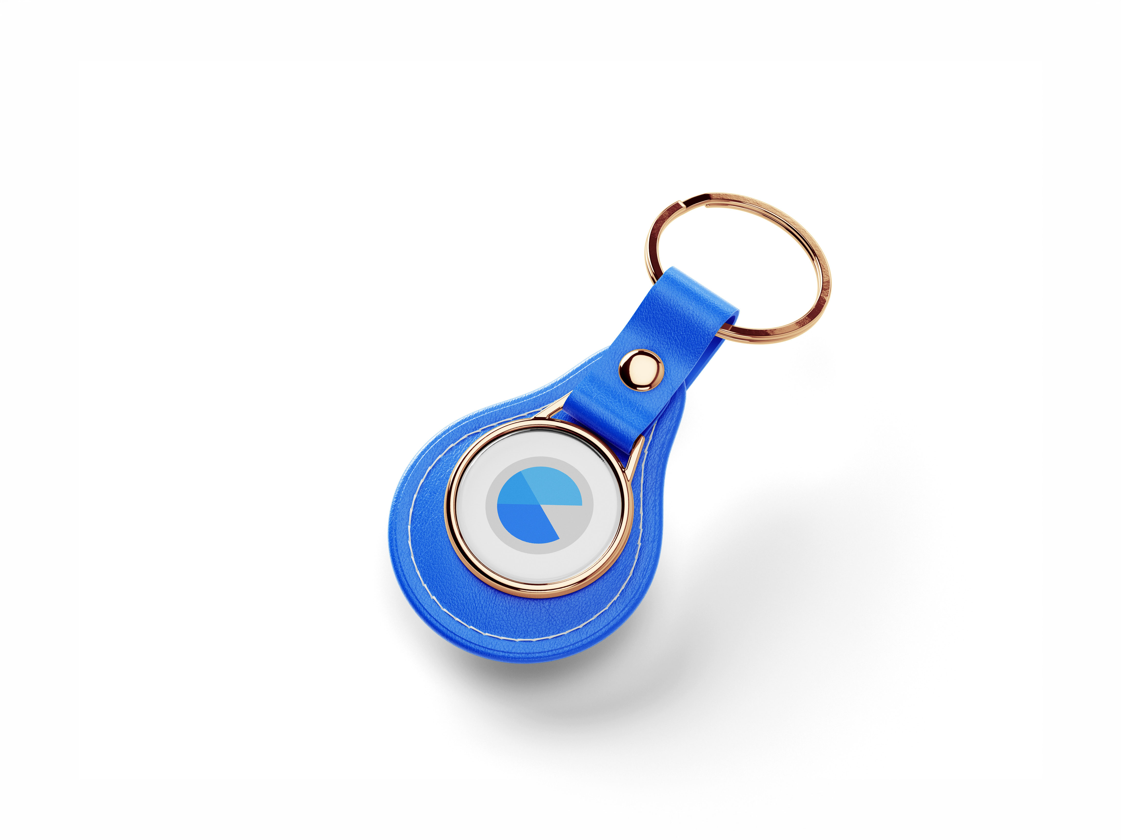
The design system built around the mark establishes clear rules for how it scales across every context. The horizontal lockup serves as the primary configuration for headers, email signatures, and document footers. At small sizes, the icon stands alone as a fully legible mark down to 24 pixels square, making it equally effective as a favicon, a social media profile image, or a watermark. On dark or blue backgrounds, the mark inverts cleanly to a white-on-blue treatment. A strict exclusion zone, equal to the height of the outer grey ring, must be maintained around the logo at all times. Typography follows the same logic: high-contrast serif headings carry editorial authority, while the rounded sans-serif used in the wordmark handles body and UI text with warmth and legibility. No more than two blues should appear simultaneously in body copy, and Electric Blue is reserved exclusively for calls to action and primary interface elements.
Outcome
The completed Exctly identity achieves what every great logo must: it communicates before a single word is read. The icon alone conveys data, targeting, and forward momentum. When paired with the wordmark, the brand positions Exctly for exactly what it is — a service that finds precisely the right people for your business, and does so with the kind of confidence that makes the promise feel credible before the conversation even begins.